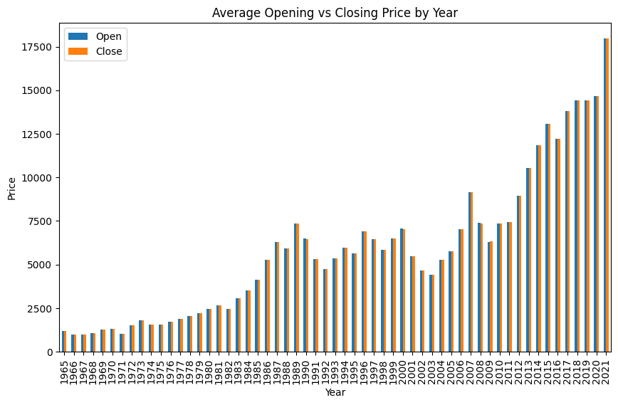
Bar Graph-Average Opening vs Closing Price by Year
This bar graph shows the relationship between the average opening price and closing price per year. Basically, it shows if the closing price is different from the opening price. According to the graph there are no drastic changes. But there is consistently a 100 to 200 dollar difference. Most of the years, the average opening price is higher, but there are a few years where the closing price is higher
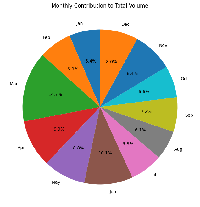
Pie Chart - Monthly Contribution to Total Volume
This pie chart shows the monthly contribution to the total volume of the stock market. These results are based off of only 2020. The pie chart shows that March was the month that had the most trading activity in 2020. It had 14.7% of the volume of the entire year. The month with the least amount of trading activity is August, which has a trading activity of 6.1%. The pie chart shows that some months have more trading activity than others. But they aren't drastically different.
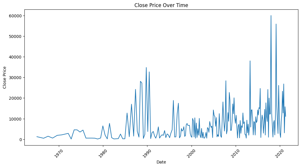
Line Plot - Closing Price Over Time
This line plot shows the closing price of the stock market over time. It is gradually increasing. The closing prices spikes up in 1990 and then drastically goes down. This repeats between 2010 and 2020. This shows that the closing prices of the stock market are generally increasing as the economy is expanding.